
Improving Internal Communication Through a Client Intranet Redesign
A 6-week collaboration between Write the Vision Consulting Group and the Design Lab spring capstone cohort focused on developing a UI and brand component library.
Designed and delivered a 4-page MVP prototype in Figma to validate core user flows.
Built a modular UI component system to ensure consistency and scalability across the product.
Produced development-ready documentation and handoff assets to support engineering implementation.
Facilitated UX/UI design and prototyping training, culminating in a certification for 3 students.
Users struggle to find information and complete tasks due to unclear information architecture and fragmented systems
As the central platform for internal operations and collaboration, the intranet was intended to streamline access to information and connect workflows. Instead, resources were difficult to locate and communication remained fragmented across channels, resulting in inefficient workarounds in day-to-day tasks. From this, we first defined the project structure and team split to guide execution.
To jumpstart our project, I created a Gantt chart to track progress from start to finish

To ensure project completion, I created a schedule and sprint plan that broke the work into clear phases with milestones and deadlines

I created a FigJam board as a central space for real-time design, collaboration, and feedback.

To understand the current state, they conducted an audit of existing systems and user flows and identified 3 key friction points, gaps, and opportunities for improvement

To kick off the project, we first developed a foundational understanding of intranet systems and the core requirements of an effective internal platform
Understanding user needs through persona development
To better understand user needs and key pain points, we developed three user personas representing different patterns of system engagement.
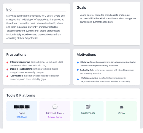
Using these 3 key points, we then synthesized interview insights through affinity mapping to uncover key themes shaping the overall experience
These insights revealed 3 areas of opportunity translated into "How Might We" directions to guide solutions
To understand how these issues appear, we analyzed the site architecture to identify structural gaps and reorganization opportunities


Translating user insights into a reworked site map
User interviews revealed the previous intranet was difficult to navigate and lacked clear structure. We restructured the sitemap using user and stakeholder feedback to improve clarity, access, and overall discoverability.
Transforming the new structure into low-fidelity wireframes
After restructuring the site map, we explored 15 iterations of black-and-white wireframes to define structure and user flow. This phase focused on identifying three user access levels and shaping them into a clear, role-based experience.

From there, we went through 4 rounds of mid-fidelity iterations to refine structure, improve usability, and further develop the role-based experience.

We had 5 users test out our prototype

After receiving feedback from our workshop, we implemented refinements to improve usability, clarity, and cohesion.
